

Product pages took 4+ seconds
Shoppers on phones waited too long to see the product.
Case study · Shopify · Apparel
Fair Harbor is a Certified B Corp menswear and swim brand whose clothing is made from recycled plastic bottles. We rebuilt the mobile product page and tuned checkout for Shop Pay and Apple Pay.
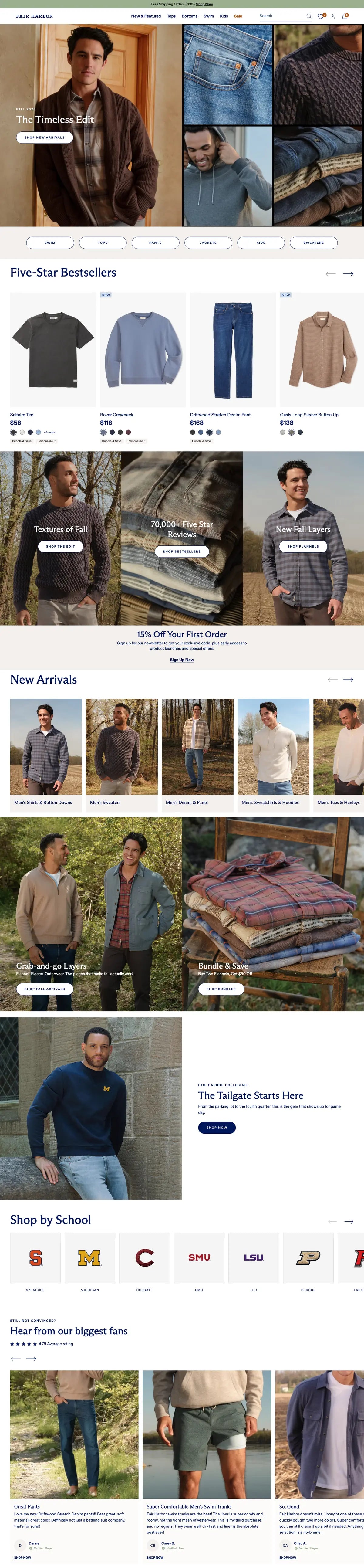
Live storefront · scrolling top to bottom
01 / PROJECT DETAILS
The range covers swim, tops, bottoms, denim and kids.
fairharborclothing.com (opens in a new tab)What we delivered
02 / THE PROBLEM
Fair Harbor had a beautiful brand but a poorly converting mobile experience. Product pages took 4+ seconds to load, the gallery wasn't tuned for swipe-first mobile browsing, and Apple Pay wasn't appearing properly in mobile Safari for 30% of users.
Shoppers on phones waited too long to see the product.
The product gallery wasn't tuned for swipe-first mobile browsing.
The button wasn't appearing properly in mobile Safari.
The mobile experience was not doing justice to the product.
03 / THE SOLUTION
A mobile-first product page rebuild with editorial galleries, smarter variant selection, trust signals, and a checkout tuned for Shop Pay and Apple Pay across every iOS version we tested.
Galleries designed for the thumb, carrying the product story on a phone screen.
Variants are organised by fit, so choosing a size takes less thought.
Sustainability badges and return guarantees sit on the product page.
Checkout was tuned and tested across every iOS version we could get hold of.
Desktop and mobile · the same build
04 / STRATEGY
Four decisions shaped the build.
01
The product page was rebuilt for the phone and scaled up, not the other way round.
02
Editorial galleries built for swiping do the work a long description cannot.
03
Fit comes first in variant selection, because fit is the question shoppers actually have.
04
Fast wallets only help when they appear, so they were tested version by version.
05 / SCREENS
The whole homepage on desktop and on a phone, scrolling top to bottom side by side. Hover to hold it still.

06 / RESULTS
+27%
Revenue per visitor
after the redesign and checkout rebuild
72%
Mobile share
4.9/5
UX rating
07 / PROCESS
The same four stages as every engagement, with the specific work done for Fair Harbor at each one. The steps play through in order.
Stage 1
We review the current theme, apps and analytics, then write a fixed-scope SOW with named deliverables and a date.
What we did for Fair Harbor
Stage 2
Work happens in a dev store on a Git-backed workflow. You get a preview link from week one, not a reveal at the end.
What we did for Fair Harbor
Stage 3
Cross-browser and device QA, redirect map, analytics verification, then a launch window agreed with you rather than dropped on you.
What we did for Fair Harbor
Stage 4
Fourteen to sixty days of included post-launch support while real traffic finds the edge cases.
What we did for Fair Harbor
08 / THE STOREFRONT
The full Fair Harbor homepage as shoppers see it. Scroll inside the frame to move through it from the offer strip to the footer.
09 / MORE WORK
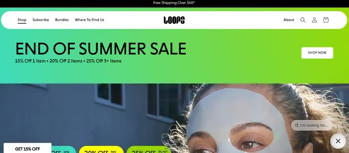 Shopify · Mobile app
Loops Beauty: Quiz-driven subscription + native mobile app
App CR3.2×Push opt-in72%Quiz CAC$8
Read the case study
Shopify · Mobile app
Loops Beauty: Quiz-driven subscription + native mobile app
App CR3.2×Push opt-in72%Quiz CAC$8
Read the case study
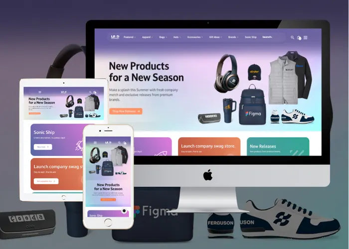 Shopify · B2B
Lead Apparel: 50+ brands of company merch, one B2B storefront
Licensed brands50+Decoration methods5Ways to browse4
Read the case study
Shopify · B2B
Lead Apparel: 50+ brands of company merch, one B2B storefront
Licensed brands50+Decoration methods5Ways to browse4
Read the case study
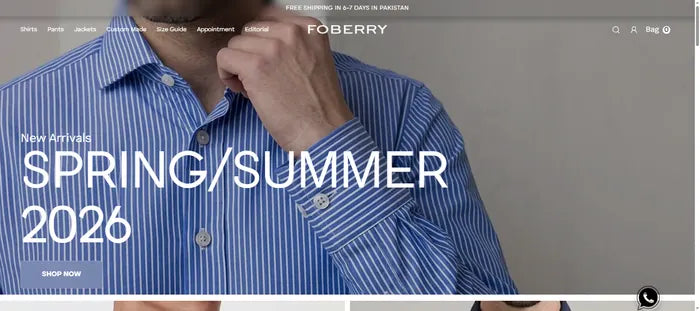 Shopify · Apparel
Foberry: ready-made and made-to-measure, in one Shopify store
Custom shirt fabrics130+Size guides3Verified reviews200+
Read the case study
Shopify · Apparel
Foberry: ready-made and made-to-measure, in one Shopify store
Custom shirt fabrics130+Size guides3Verified reviews200+
Read the case study